A powerful tool is only powerful if the right person can use it. A multi-AI chat tool that runs dozens of models simultaneously, compares responses, assigns personas — that's extraordinarily useful. It's also the kind of interface that can lose a first-time user in thirty seconds.
This case study is about the non-technical user. The one who just wants to ask a question. The one who shouldn't have to understand the product before the product helps them.
01 — The entry point
Two users.
One door.
The non-technical user opens the tool and needs to know immediately: what do I do first? A long list of navigation items with equal visual weight gives no answer. Everything looks equally important, so nothing guides them.
Two clearly labeled primary actions sit at the very top of the navigation — before anything else. One for starting a new conversation with a guided, minimal setup. One for building an AI team with full control. Position and visual weight do the explaining. The user understands what the tool is for before they've read a single line of copy.
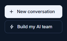
Two primary actions at the top — before anything else.
The decision
Capabilities, Personas, Assistants, Conversations — those features support the experience. "New conversation" and "Build my AI team" are the experience. The hierarchy makes that distinction visible without a single word of explanation.
02 — The new conversation page
Don't make them
decide before they're ready.
A non-technical user arriving at a new conversation shouldn't have to make decisions before they're ready to make them.
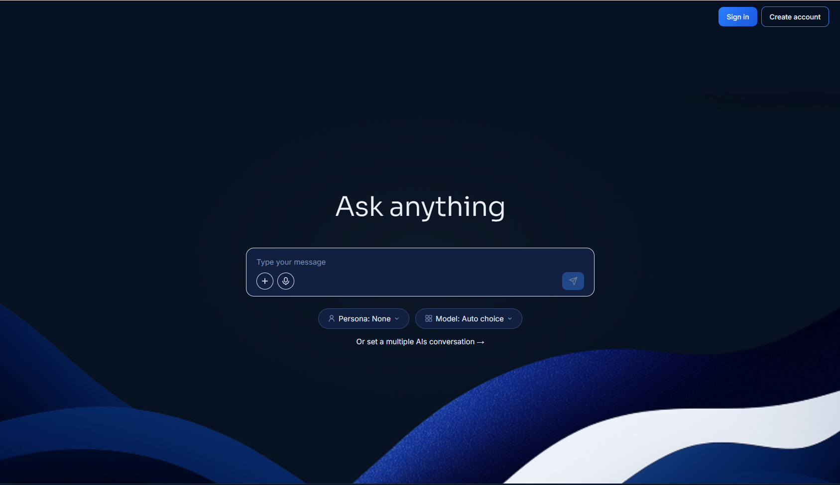
"Ask anything" — two optional pills below, a text link for the multi-model path.
The setup lives in two optional pills — Persona and Model. Both are there if the user wants to personalise. Neither demands attention. Persona offers predefined options from the tool, or a custom persona if the user has already built one. Model shows the five most powerful models available, with auto-selection active by default.
The user can adjust either pill. Or they can ignore both and just write their prompt. When they do, the tool matches them with the five best-fitted models for what they asked. The choice was always available. It was never required.
The decision
Designing for a non-technical user doesn't mean a simplified version of the product. It means a full version that doesn't demand expertise before it lets you start.

Prompt bar split: features on the left, model targeting on the right. "All models" dropdown sits next to send — impossible to miss.
The prompt input bar has a deliberate split. Everything related to features and attachments on the left. Everything related to model targeting on the right. One side is about what you're sending. The other is about who receives it.
Next to the send button — a dropdown defaulting to "All models." In a multi-model conversation, this lets you direct a prompt to one specific model. It sits right there, labeled, impossible to miss. All other input actions move left to give this control the visual space it deserves.
03 — Mobile
Same product.
Different spatial logic.
A multi-model conversation on desktop can show responses side by side. On mobile the screen is too narrow — side-by-side becomes unreadable before it becomes useful.
The solution was tab navigation at the top of the conversation — one tab per active model. The user moves between them. The experience is sequential rather than simultaneous, but the full functionality is preserved. Nothing was removed. The layout adapted to what the screen can actually support.
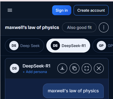
A tab bar gives the user the freedom to select which model they want to review.
The decision
Designing for mobile isn't about hiding things on small screens. It's about finding the right spatial logic for each context.
04 — Also good fit
A feature that helps you
has to be found first.
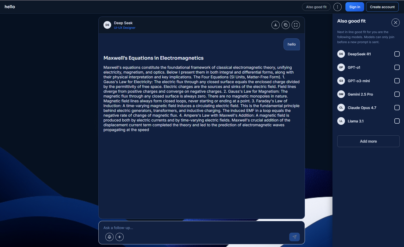
"Also good fit" — a text button, always visible. No icon knowledge required.
After sending a prompt, the tool surfaces additional models that would be a good fit for the conversation. This is one of the most useful things the product does for a non-technical user — it removes the burden of knowing which model to choose.
If a user doesn't notice a feature, they can't use it. To make sure that didn't happen, I added a temporary labeled button next to the three-dot menu — visible until the second prompt was sent. That gave them a clear path to the suggested models before they needed to know where to look on their own.
The decision
A text button. Always visible, always labeled. A feature that helps you can't help you if you don't know it exists. For the non-technical user, discoverability isn't a nice-to-have — it's the whole point.
05 — One extra click
Some friction
is the right answer.
Removing a model from a conversation is permanent. There is no undo.
For a non-technical user, a permanent action without a warning is a trap. One extra click — in exchange for making sure no user loses a model's entire conversation thread by accident. The cost of the extra click is low. The cost of skipping it — once — is not.
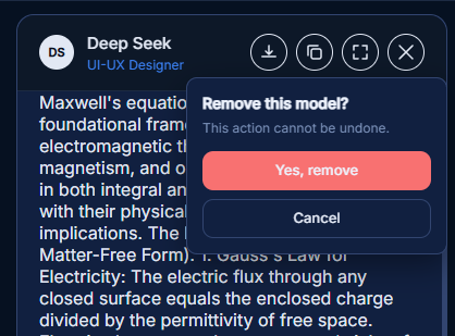
"Remove this model? This action cannot be undone." One extra click that protects permanent decisions.
The decision
Protecting the user from irreversible mistakes isn't friction. It's care. And for someone still learning what the tool can do, it's the difference between a recoverable mistake and a frustrating dead end.
Live prototype
Try it yourself.
This was built in code — not prototyped in Figma. Navigate through the actual interface and experience the design decisions firsthand.
Prototype coming soon
The live prototype will be embedded here once deployed. Built entirely in HTML, CSS and vanilla JavaScript.
Designing for someone who doesn't know the product yet is the hardest kind of design.
You can't assume they'll explore. You can't assume they'll read. You can't assume they'll try again if the first attempt feels wrong. You get one chance to make them feel like the tool was built for them.
Every decision in this case study — the optional pills, the auto model matching, the text button, the confirmation dialog — is about removing the moment where a non-technical user thinks: "I don't know what to do here." That moment is the one you can't afford.