Foodie was the final capstone project of a three-month UI/UX Design Foundations program by AllWomen.
The program combined live instruction, weekly assignments, independent study, and a final product design project. To complete the course, participants were required to apply the full UX process—from research and user flows to wireframes, visual design, and prototyping—and submit a complete case study.
For my final project, I designed Foodie, a recipe and meal-planning app focused on helping users discover recipes based on ingredients they already had at home.
Two years later, after working on real products alongside developers, I revisited the project to evaluate how my thinking had evolved and what I would design differently today.
Building the
first version.
The original concept focused on helping people discover recipes, plan meals, and cook with more confidence using ingredients they already had.
ResearchPeople often decide what to cook based on ingredients they already have.
People struggle to organize recipes and return to them later.
Cooking decisions are influenced by preparation time and complexity.
These observations shaped the structure of the app — search by what you have, a home page for daily planning, and a recipe page built to support the full cooking experience. The product wasn't a collection of screens. It was a response to how people actually decide what to eat.
Interface conceptOriginal Low-Fidelity
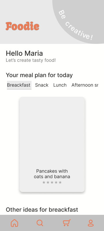
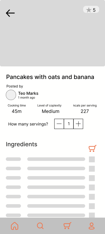
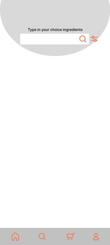
Original High-Fidelity
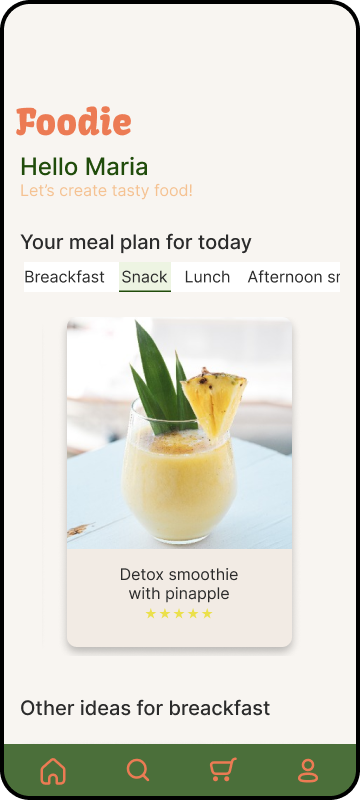
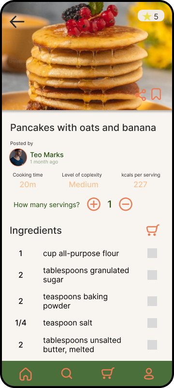
Two years
later.
After working on real products, I revisited Foodie expecting to notice visual issues.
Instead, the biggest gaps were in interaction logic.
The research was often right. The interface behavior wasn't.
What changed was my ability to translate valid user needs into interactions that supported real goals.
It looked right.
It didn't work right.
Users wanted a simple way to follow their meal plan while still having the flexibility to change meals when preferences, time, or circumstances changed.
A home screen centered around the current meal, supported by recommendations and alternative recipes for each meal category.
The structure supported discovery, but it didn't support decision-making.
Users could browse alternatives, but they couldn't easily compare them. Important information such as preparation time, calories, and recipe complexity was hidden inside the recipe page.
As a result, choosing between options often required opening multiple recipes before making a decision.
I would surface the information users need to evaluate recipes directly within the recommendation cards.
Preparation time, calories, and difficulty level would help users compare alternatives quickly and decide whether to follow the planned meal or choose something else with less effort.
The redesign should focus on helping users make decisions with fewer clicks rather than simply presenting more recipe options.
Home page
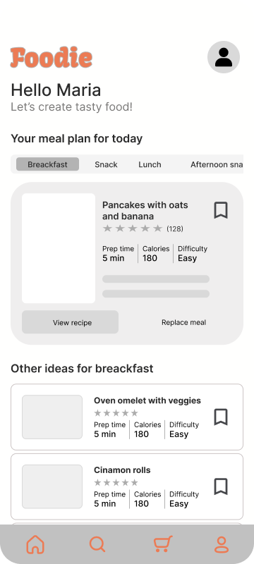
At the time, I focused on helping users discover recipes. Today, I would focus on helping them choose between them.
All the information.
None of the rhythm.
Users wanted a place where they could quickly access ingredients, instructions, nutritional information, reviews, and shopping list functionality while preparing meals.
The goal was not simply to find recipes but to successfully complete them.
I brought everything together on a single screen.
Ingredients, instructions, nutritional information, preparation details, and reviews were all accessible without requiring additional navigation.
At the time, my goal was to make information easy to access and reduce the need for users to move between different screens.
Although all the information was available, the experience was optimized for reading rather than cooking.
Users interact with recipes as a workflow. They check ingredients, prepare items, follow instructions, track progress, and often return to previous steps.
By placing everything on a single page, I treated the recipe as a document instead of a task that unfolds over time.
The challenge wasn't information access. It was helping users move through the process with confidence.
I would organize the experience around the cooking workflow.
The redesign should introduce dedicated sections for Ingredients, Instructions, and Reviews — clear step numbering, better support for tracking progress through the recipe, faster navigation between sections, and a stronger connection between ingredients and shopping list actions.
The goal would be to support users while cooking rather than simply presenting recipe information.
Recipe page
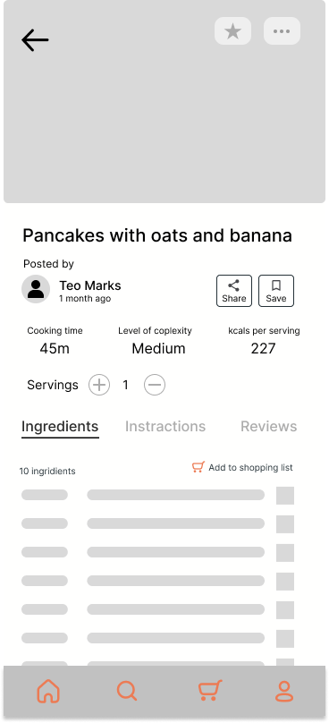
At the time, I focused on making information available. Today, I would focus on helping users complete the task. The difference seems small, but it fundamentally changes how the experience is structured.
Decoration
pretending to be UI.
The feature users wanted most was search by ingredients they already had. Search wasn't a secondary action — it was the most important entry point in the app.
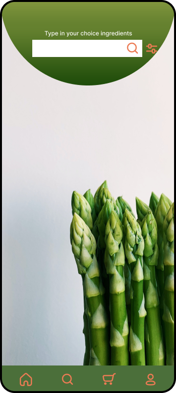
A search field and a full-screen photo of asparagus.
The screen looked finished, but it wasn't helping users take action.
I treated the empty state as a visual problem — something to fill so the screen wouldn't look bare. The user had to already know what they wanted before the screen would help them. No guidance. No starting point.
Search mode tabs to surface what the app can do. Ingredient chips to start with one tap. Recent searches to pick up where you left off. Popular recipes filling the space with something useful — not decorative.
Search
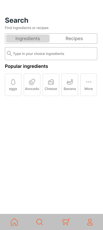
An empty state is a moment of maximum uncertainty — and that's when the interface needs to be most useful. I was solving a visual problem. I should have been solving a guidance problem.
Reflection
Revisiting Foodie helped me understand the difference between identifying user needs and designing for them.
The original research pointed to real problems: decision-making, cooking workflows, and uncertainty around where to start.
What changed was my ability to translate those insights into interface behavior.
The process gave me the right questions.
Experience taught me how to answer them.