Some users don't want the tool to choose for them. They want to select every model deliberately, assign a persona to each one, and enter the conversation knowing exactly what's running and why.
Designing for that user means giving them full control without burying them in complexity. Every decision exposed. Every option within reach. Nothing hidden, nothing assumed.
01 — Build my AI team
A dedicated space for
deliberate choices.
The power user doesn't want smart defaults. They want to see all the models, filter by provider, select exactly who joins the conversation, and configure each one before sending a single prompt.
"Build my AI team" is a dedicated page — not a hidden panel, not a settings screen. It exists at the same level as "New conversation" in the navigation, with equal visual weight, because for this user it's equally essential.
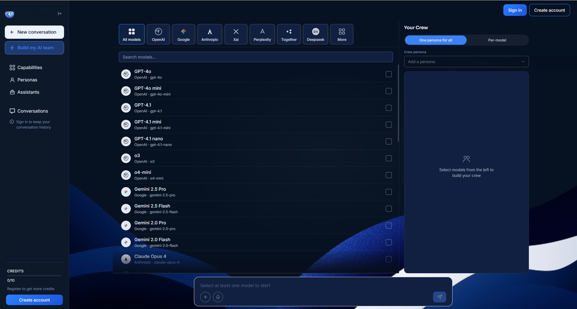
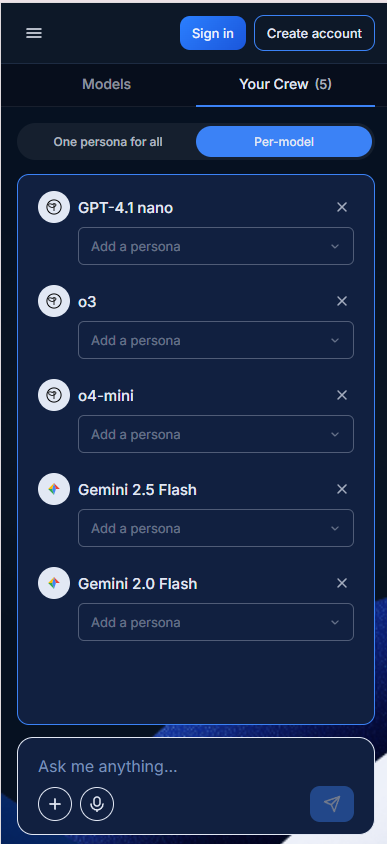
Empty state — the full model list on the left, Your Crew waiting on the right. Select and build.
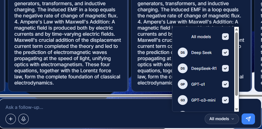
The layout is two-panel: models on the left, Your Crew on the right. Provider filter pills at the top let the user narrow the list — All models, OpenAI, Google, Anthropic, and more. Every model is visible. Every selection is immediate. The Crew panel updates in real time as they choose.
The decision
"Build my AI team" is a dedicated page, not a hidden settings panel. Every model is visible. Every persona slot is available. The user configures their team deliberately — and only then moves into the conversation with full confidence in what's running.
02 — Persona control
One for all, or
one for each.
Once the user has selected their models, they can assign personas. Two modes: one persona applied to the entire crew, or a different persona per model.
This is where the power user's control becomes granular. They might want Deep Seek acting as a software engineer while Gemini acts as a copywriter. The same prompt, two completely different lenses.
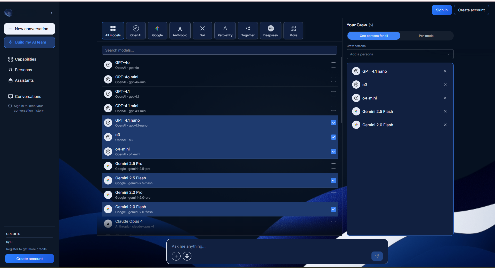
One persona for all — a single role applied across every model in the crew.
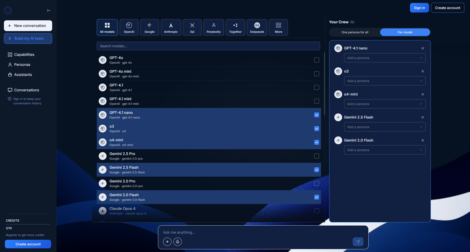
Per-model — each model gets its own persona dropdown. Full individual control.
The decision
Two modes, clearly toggled. The user switches between them with one click. Neither mode is the default — the choice is theirs from the start, and the interface makes both options equally accessible.
03 — Mobile model selection
Full power.
Small screen.
On mobile, the two-panel desktop layout isn't possible. But the power user on mobile still needs to select models, filter by provider, and manage their crew — without losing any functionality.
The solution is a tab bar: Models and Your Crew as two distinct tabs. The user moves between them deliberately. The Models tab gives full access to the provider filter and model list. The Your Crew tab shows exactly who's been selected and lets them manage personas.
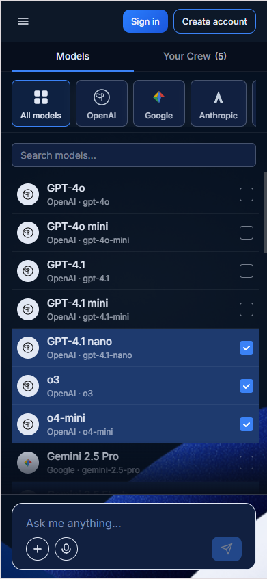
Models tab — provider filter pills at the top, full scrollable model list below.
Your Crew tab — selected models, per-model persona dropdowns, ready to go.
The decision
The tab structure isn't a compromise — it's a mobile-native pattern that matches how a power user thinks. Models first, then crew configuration. The spatial logic follows the mental model.
04 — Desktop card views
Read the way
you think.
A power user running four models simultaneously needs to be able to read and compare responses on their own terms. Some want everything visible at once. Others want to focus on one model at a time. The interface shouldn't decide that for them.
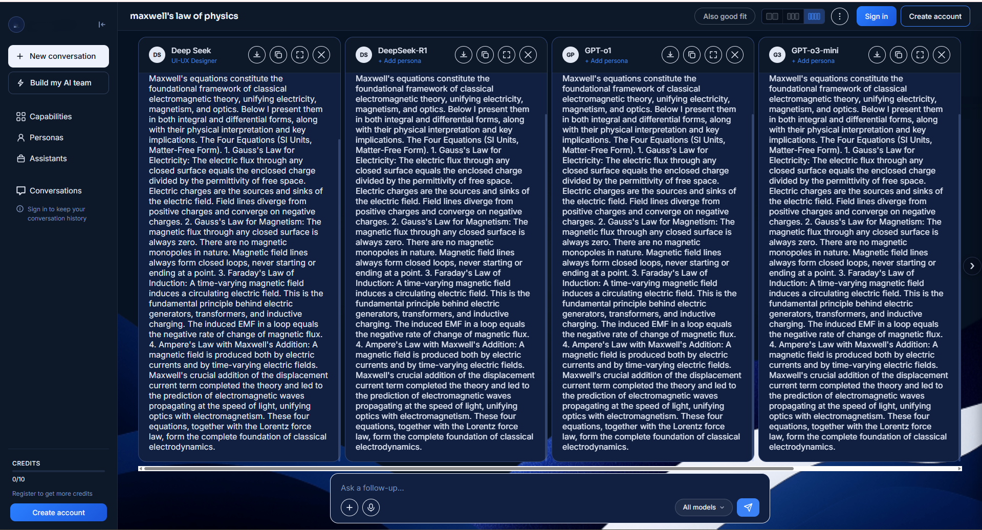
Four-column view — the full crew in one glance. View selector top right.
The card view selector offers 2, 3, or 4 columns — plus a full-screen expand on individual model cards. The options are responsive: if the screen is too narrow to display 4 cards at a meaningful minimum width, that option simply doesn't appear. The user is never offered a layout that would give them a poor experience.
The decision
Giving the user layout control isn't about adding features for its own sake. It's about respecting that different tasks require different levels of focus — and the interface shouldn't force a reading mode on someone who knows exactly how they work best.
05 — Global & local actions
Where it lives tells you
what it controls.
A power user running multiple models generates two distinct categories of actions. Some apply to the whole conversation. Others apply only to a single model's response. Mixing them in one place creates confusion. Separating them by location removes the ambiguity entirely.
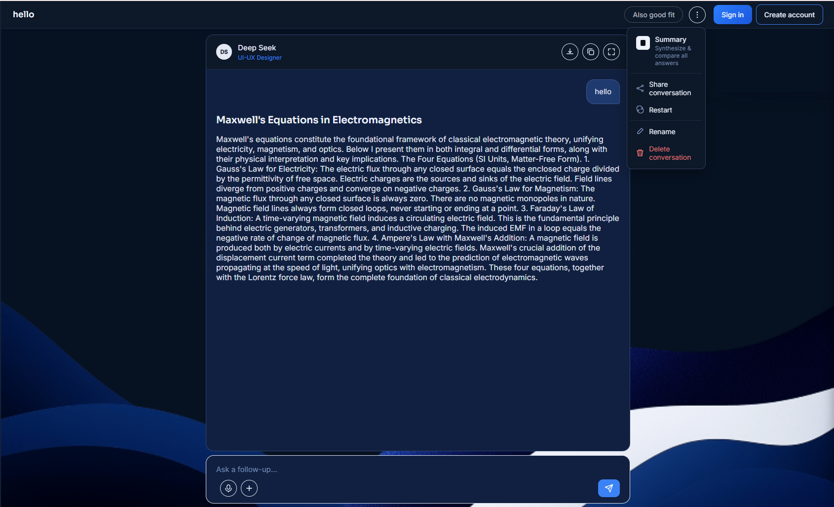
Global menu — conversation level. Summary, Share, Restart, Rename, Delete conversation.
Local menu — card level. Download, Copy, Expand. On the card, for the card.
Global actions live at the conversation level — three-dot menu at the top of the screen. Local actions live on the model card — three-dot menu on the card itself. The position is the label. You don't need to explain what these actions affect because where they live already tells you.
The decision
Structure replaces explanation. A power user running a complex multi-model workflow can't afford to second-guess which action does what. The hierarchy makes the answer self-evident.
06 — One extra click
Even experts deserve
a safety net.
The power user has deliberately built their crew. They've selected models, assigned personas, had a full conversation. Removing a model from that conversation is permanent — there is no undo.
A confirmation dialog appears before any model is removed: "Remove this model? This action cannot be undone." A clearly labeled confirm button. A cancel option. One extra click.
The argument against it is that experienced users know what they're doing and don't need confirmation. The argument for it is that destructive, irreversible actions deserve a moment of attention regardless of who is performing them. The cost of the extra click is low. The cost of skipping it — once — is not.
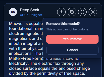
"This action cannot be undone." Even for experts.
The decision
Respecting the expert user doesn't mean removing every safety check. It means trusting them to make the right call — after being shown the consequences once.
Live prototype
Try it yourself.
This was built in code — not prototyped in Figma. Navigate through the actual interface and experience the design decisions firsthand.
Prototype coming soon
The live prototype will be embedded here once deployed. Built entirely in HTML, CSS and vanilla JavaScript.
Full control doesn't mean full complexity. It means every decision is yours to make — and the interface gets out of the way.
The power user knows what they want. They've thought about which models to use, what role each one should play, how they want to read the responses. The design's job isn't to guide them — it's to not slow them down.
Hierarchy, separation of actions, responsive layout options, deliberate confirmation before destructive steps — none of these feel like features when they work correctly. They just feel like a tool that understands how you think.